


Description
SPECIFICATIONS
Brand Name: XMSJ
Origin: Mainland China
DIY Supplies: ELECTRICAL
Type: Combination
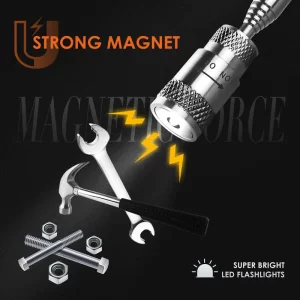
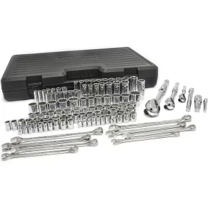
About this item
- 1/4in,3/8in and 1/2in Quick-release ratchets feature a fine, 45-tooth gear, providing an 8° arc swing
- Universal various of sockets are constructed of chrome vanadium steel, heat treated for strength and durability, bright Chrome-plated surface that allows you to easily identify your universal tools in your tool box or on your work bench
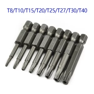
- With stamped marking for you to quickly identify metric and SAE socket sizes
- All tools are neatly organized in a sturdy blow-molded case for easy storage and transportation
- All tools meets or exceeds ANSI standards
Product information
Technical Details
| Color | Red, Silver, Black |
|---|---|
| Material | Chrome Vanadium Steel, Plastic |
| Item Dimensions LxWxH | 18.31 x 13.78 x 12.4 inches |
| Item Package Quantity | 1 |
| Head Style | Box End, Hex |
| Finish Type | Polished |
| Operation Mode | Mechanical |
| Item Weight | 43.1 pounds |
| Product Dimensions | 18.31 x 13.78 x 12.4 inches |
| Is Discontinued By Manufacturer | No |
| Size | 450-piece |
| Style | Universal |
| Finish | Polished |
| Batteries Included? | No |
| Batteries Required? | No |
.aplus-v2 .premium-aplus-module-3 .premium-module-3-heading {
padding-bottom: 40px;
}
.aplus-v2 .premium-aplus-module-3 .premium-aplus-four-column {
text-align: center;
}
.aplus-v2 .premium-aplus-module-3 .premium-aplus-four-column {
text-align: inherit;
}
.aplus-v2 .premium-aplus-module-3 .premium-aplus-column {
display: inline-block;
vertical-align: top;
width: 25%;
}
.aplus-v2 .premium-aplus-module-3 .premium-aplus-column {
padding: 0 20px;
}
.aplus-v2 .premium-aplus-module-3 .column-heading {
padding-top: 20px;
}
.aplus-v2 .premium-aplus-module-3 .column-description {
padding-top: 10px;
}
.aplus-v2 .premium-aplus-module-2 .premium-background-wrapper {
position: relative;
}
.aplus-v2 .premium-aplus-module-2 .premium-intro-wrapper {
position: absolute;
width: 50%;
height: 100%;
top: 0;
}
.aplus-v2 .premium-aplus-module-2 .premium-intro-wrapper.right {
left: 50%;
}
html[dir=”rtl”] .aplus-v2 .premium-aplus-module-2 .premium-intro-wrapper.right {
left: auto;
right: 50%;
}
.aplus-v2 .premium-aplus-module-2 .premium-intro-wrapper.secondary-color {
color: #fff;
}
.aplus-v2 .premium-aplus-module-2 .premium-intro-background {
padding: 20px;
}
.aplus-v2 .premium-aplus-module-2 .aplus-module-2-topic {
padding-bottom: 10px;
}
.aplus-v2 .premium-aplus-module-2 .aplus-module-2-heading {
padding-bottom: 20px;
}
.aplus-v2 .premium-aplus-module-2 .aplus-module-2-description {
line-height: 1.5em;
}
.aplus-v2 .premium-aplus-module-2 .premium-intro-background.white-background {
background: rgba(255,255,255,0.5);
}
.aplus-v2 .premium-aplus-module-2 .premium-intro-background.black-background {
background: rgba(0,0,0,0.5);
}
.aplus-v2 .premium-aplus-module-2 .premium-intro-background.black-background,
.aplus-v2 .premium-aplus-module-2 .premium-intro-background.black-background h1,
.aplus-v2 .premium-aplus-module-2 .premium-intro-background.black-background h5,
.aplus-v2 .premium-aplus-module-2 .premium-intro-background.black-background ol,
.aplus-v2 .premium-aplus-module-2 .premium-intro-background.black-background ul,
.aplus-v2 .premium-aplus-module-2 .premium-intro-background.black-background ol .a-list-item,
.aplus-v2 .premium-aplus-module-2 .premium-intro-background.black-background ul .a-list-item {
color: #fff;
}
.aplus-v2 .premium-aplus-module-2 .premium-intro-content-container {
display: table;
height: 100%;
}
.aplus-v2 .premium-aplus-module-2 .premium-intro-wrapper.left .premium-intro-content-container {
padding-left: 40px;
}
html[dir=”rtl”] .aplus-v2 .premium-aplus-module-2 .premium-intro-wrapper.left .premium-intro-content-container {
padding-left: 0px;
padding-right: 40px;
}
.aplus-v2 .premium-aplus-module-2 .premium-intro-wrapper.right .premium-intro-content-container {
padding-right: 40px;
}
html[dir=”rtl”] .aplus-v2 .premium-aplus-module-2 .premium-intro-wrapper.right .premium-intro-content-container {
padding-right: 0px;
padding-left: 40px;
}
.aplus-v2 .premium-aplus-module-2 .premium-intro-content-column {
display: table-cell;
vertical-align: middle;
}
/**
* Premium modules global styles
*/
.aplus-v2.desktop {
max-width: 1464px;
min-width: 800px;
margin-left: auto;
margin-right: auto;
word-wrap: break-word;
overflow-wrap: break-word;
word-break: break-word;
}
/* Undo this for tech-specs because it breaks table layout */
.aplus-v2.desktop .premium-aplus .aplus-tech-spec-table { word-break: initial; }
.aplus-v2 .premium-aplus,
.aplus-v2 .premium-aplus .aplus-h1,
.aplus-v2 .premium-aplus .aplus-h2,
.aplus-v2 .premium-aplus .aplus-p1,
.aplus-v2 .premium-aplus .aplus-p2,
.aplus-v2 .premium-aplus .aplus-p3,
.aplus-v2 .premium-aplus .aplus-accent1,
.aplus-v2 .premium-aplus .aplus-accent2
{ font-family: Arial, sans-serif; }
.aplus-v2 .premium-aplus,
.aplus-v2 .premium-aplus .aplus-h1,
.aplus-v2 .premium-aplus .aplus-h2,
.aplus-v2 .premium-aplus .aplus-p1,
.aplus-v2 .premium-aplus .aplus-p2,
.aplus-v2 .premium-aplus .aplus-p3,
.aplus-v2 .premium-aplus .aplus-accent1,
.aplus-v2 .premium-aplus .aplus-accent2
{ font-family: inherit; }
/* type */
.aplus-v2 .premium-aplus .aplus-h1 { font-size: 32px; line-height: 1.2em; font-weight: 500; }
.aplus-v2 .premium-aplus .aplus-h2 { font-size: 26px; line-height: 1.25em; font-weight: 500; }
.aplus-v2 .premium-aplus .aplus-h3 { font-size: 18px; line-height: 1.25em; font-weight: 500; }
.aplus-v2 .premium-aplus .aplus-p1 { font-size: 20px; line-height: 1.3em; font-weight: 300; }
.aplus-v2 .premium-aplus .aplus-p2 { font-size: 16px; line-height: 1.4em; font-weight: 300; }
.aplus-v2 .premium-aplus .aplus-p3 { font-size: 14px; line-height: 1.4em; font-weight: 300; }
.aplus-v2 .premium-aplus .aplus-accent1 { font-size: 16px; line-height: 1.4em; font-weight: 600; }
.aplus-v2 .premium-aplus .aplus-accent2 { font-size: 14px; line-height: 1.4em; font-weight: 600; }
/* spacing */
.aplus-v2 .aplus-container-1 { padding: 40px; }
.aplus-v2 .aplus-container-1-2 { padding: 40px 80px; }
.aplus-v2 .aplus-container-2 { padding: 80px; }
.aplus-v2 .aplus-container-3 { padding: 40px 0; }
/* Display */
.aplus-v2 .premium-aplus .aplus-display-table { display: table; }
.aplus-v2 .premium-aplus .aplus-display-table-cell { display: table-cell; }
.aplus-v2 .premium-aplus .aplus-display-inline-block { display: inline-block; }
/* Aplus display table with min-width 1000px and fill remaining space inside parent */
.aplus-v2.desktop .premium-aplus .aplus-display-table-width { min-width: 1000px; width: 100% }
/**
* Padding and margin for element should be 10, 20, 40, or 80 px. Considering mini 10, small 20, medium 40, large 80.
*/
.premium-aplus-module-15 {
padding: 40px 0;
text-align: left;
}
.aplus-v2 .premium-aplus-module-15 {
text-align: inherit;
}
.aplus-v2 .premium-aplus-module-15 .premium-aplus-15-heading-text {
padding-bottom: 20px;
}
.aplus-v2 .premium-aplus-module-15 p {
padding-bottom: 10px;
}
/**
* Premium-module 14: Carousel
*/
.aplus-v2 .premium-aplus-module-14 .aplus-carousel-container {
position: relative;
}
.aplus-v2 .premium-aplus-module-14 .aplus-carousel-element {
position: relative;
width: 100%;
}
.aplus-v2 .premium-aplus-module-14 .aplus-pagination-wrapper {
position: absolute;
top: 92%;
width: 100%;
}
.aplus-v2 .premium-aplus-module-14 .text-panel-container {
vertical-align: middle;
text-align: left;
width: 50%;
}
html[dir=”rtl”] .aplus-v2 .premium-aplus-module-14 .text-panel-container {
text-align: right;
}
.aplus-v2 .premium-aplus-module-14 .media-placeholder {
padding-bottom: 75%; /* Aspect ratio 4:3 for video and image */
}
.aplus-v2 .premium-aplus-module-14 .media-container {
position: absolute;
top: 0;
width: 50%;
height: 100%;
padding-bottom: 5%;
}
.aplus-v2 .premium-aplus.premium-aplus-module-14 .title {
padding-bottom: 20px;
}
.aplus-v2 .premium-aplus-module-14 .a-carousel-left {
margin-top: 17%;
}
.aplus-v2 .premium-aplus-module-14 .a-carousel-right {
margin-top: 17%;
}
.aplus-v2 .premium-aplus-module-14 .a-carousel-col {
height: 10%;
}
/**
* Premium-module 13: Carousel
*/
.aplus-v2 .premium-aplus-module-13 .aplus-carousel-container {
position: relative;
}
.aplus-v2 .premium-aplus-module-13 .aplus-carousel-element {
position: relative;
width: 100%;
}
.aplus-v2 .premium-aplus-module-13 .aplus-card-description-wrapper {
position: absolute;
top: 0;
left: 0;
width: 100%;
height: 100%;
}
.aplus-v2 .premium-aplus-module-13 .aplus-card-description {
display: table;
width: 50%;
height: 100%;
color: #fff;
}
.aplus-v2 .premium-aplus-module-13 .aplus-card-table-cell {
display: table-cell;
vertical-align: middle;
text-align: left;
}
html[dir=”rtl”] .aplus-v2 .premium-aplus-module-13 .aplus-card-table-cell {
text-align: right;
}
.aplus-v2 .premium-aplus-module-13 .aplus-text-background {
background: rgba(0, 0, 0, 0.5);
}
.aplus-v2 .premium-aplus-module-13 .aplus-text-background,
.aplus-v2 .premium-aplus-module-13 .aplus-text-background h1,
.aplus-v2 .premium-aplus-module-13 .aplus-text-background h5,
.aplus-v2 .premium-aplus-module-13 .aplus-text-background ol,
.aplus-v2 .premium-aplus-module-13 .aplus-text-background ul,
.aplus-v2 .premium-aplus-module-13 .aplus-text-background ol .a-list-item,
.aplus-v2 .premium-aplus-module-13 .aplus-text-background ul .a-list-item {
color: #fff;
}
.aplus-v2 .premium-aplus-module-13 .aplus-card-body {
padding: 20px 40px 0 0;
}
html[dir=”rtl”] .aplus-v2 .premium-aplus-module-13 .aplus-card-body {
padding: 20px 0 0 40px;
}
.aplus-v2 .premium-aplus-module-13 .aplus-card-link-button {
text-align: center;
padding-top: 20px;
}
.aplus-v2 .premium-aplus-module-13 .aplus-pagination-wrapper {
position: absolute;
top: 92%;
width: 100%;
}
.aplus-mantle.aplus-module .aplus-pagination-dots {
margin: 0;
}
.aplus-mantle.aplus-module .aplus-pagination-dot {
display: inline-block;
list-style: none;
}
.aplus-mantle.aplus-module .aplus-carousel-nav {
text-align:center;
}
.aplus-mantle.aplus-module .carousel-slider-circle {
display: inline-block;
cursor: pointer;
height: 15px;
width: 15px;
border: 1px solid #000;
border-radius: 20px;
background-color: #fff;
margin-left: 5px;
}
.aplus-mantle.aplus-module .carousel-slider-circle.aplus-carousel-active {
background-color: #FFA500;
}
/*
* Used when device = desktop
* Configured in: configuration/brazil-config/global/brand-story.cfg
*/
/* Because the carousel is implemented as an ol list,
any lists in the card text will have a secondary list style (letters).
This will give an incorrect appearance to viewers,
so we set all lists to the primary list style (numbers). */
.aplus-brand-story-card ol li {
list-style: decimal;
}
/* Top level containers */
.aplus-module .apm-brand-story-hero {
-moz-box-sizing: border-box;
-webkit-box-sizing: border-box;
box-sizing: border-box;
width: 1464px;
height: 625px;
background-color: #fff;
}
.aplus-module .apm-brand-story-card {
-moz-box-sizing: border-box;
-webkit-box-sizing: border-box;
box-sizing: border-box;
width: 362px;
height: 453px;
background-color: #fff;
}
.apm-brand-story-hero,
.apm-brand-story-card {
-moz-box-sizing: border-box;
-webkit-box-sizing: border-box;
box-sizing: border-box;
position: relative;
width: 100%;
height: 100%;
float: none;
}
.aplus-module.brand-story-card-1-four-asin .apm-brand-story-card {
/* Only 12px to account for image cell border */
padding: 12px;
}
/* Full background image (Hero 1 & Card 2) */
.aplus-module .apm-brand-story-background-image {
-moz-box-sizing: border-box;
-webkit-box-sizing: border-box;
box-sizing: border-box;
overflow: hidden;
position: absolute;
width: 100%;
height: 100%;
}
/* Card 1 small images */
.aplus-module .apm-brand-story-image-row {
-moz-box-sizing: border-box;
-webkit-box-sizing: border-box;
box-sizing: border-box;
height: 185px;
padding: 0px;
margin: auto;
display: flex;
}
.aplus-module .apm-brand-story-image-row .apm-brand-story-image-cell {
/* Use content-box to ensure image size matches editor schema */
-moz-box-sizing: content-box;
-webkit-box-sizing: content-box;
box-sizing: content-box;
padding: 0px;
margin: 0px;
width: 166px;
border: 1px solid #fff;
}
.aplus-module .apm-brand-story-image-row .apm-brand-story-image-cell .apm-brand-story-image-link {
display: block;
width: 100%;
height: 100%;
}
.aplus-module .apm-brand-story-image-row .apm-brand-story-image-cell .apm-brand-story-image-link .apm-brand-story-image-img {
display: block;
width: 100%;
height: 100%;
object-fit: cover;
}
/* Card 3 logo image */
.aplus-module .apm-brand-story-logo-image {
-moz-box-sizing: content-box;
-webkit-box-sizing: content-box;
box-sizing: content-box;
height: 145px;
margin: 0px 4px;
padding: 20px;
padding-bottom: 0px;
}
/* Text overlays */
.aplus-module .apm-brand-story-text-bottom {
-moz-box-sizing: border-box;
-webkit-box-sizing: border-box;
box-sizing: border-box;
position: absolute;
bottom: 13px;
left: 13px;
}
.aplus-module .apm-brand-story-hero .apm-brand-story-text-bottom {
background-color: rgba(0,0,0,0.6);
color: #fff;
padding: 13px 65px 13px 13px; /* accounts for overlap of first card */
width: 437px;
}
.aplus-module.brand-story-card-2-media-asset .apm-brand-story-text-bottom {
background-color: rgba(255,255,255,0.6);
color: #000;
padding: 13px;
width: 336px;
}
.aplus-module.brand-story-card-1-four-asin .apm-brand-story-text {
margin-top: 8px;
}
.aplus-module.brand-story-card-1-four-asin .apm-brand-story-text.apm-brand-story-text-single {
margin-top: 20px;
}
.aplus-module.brand-story-card-1-four-asin .apm-brand-story-text h3 {
white-space: nowrap;
overflow: hidden;
text-overflow: ellipsis;
}
.aplus-module .apm-brand-story-slogan-text {
-moz-box-sizing: content-box;
-webkit-box-sizing: content-box;
box-sizing: content-box;
margin: 0px 4px;
padding: 20px;
}
.aplus-module .apm-brand-story-faq {
-moz-box-sizing: content-box;
-webkit-box-sizing: content-box;
box-sizing: content-box;
padding-top: 10px;
}
.aplus-module .apm-brand-story-faq-block {
margin: 0px 10px;
padding: 10px;
}
.aplus-v2 .apm-brand-story-carousel-container {
position: relative;
}
.aplus-v2 .apm-brand-story-carousel-hero-container,
.aplus-v2 .apm-brand-story-carousel-hero-container > div {
position: absolute;
width: 100%;
}
/*
Ensuring the carousel takes only the space it needs.
The sizes need to be set again on the absolutely positioned elements so they can take up space.
*/
.aplus-v2 .apm-brand-story-carousel-container,
.aplus-v2 .apm-brand-story-carousel-hero-container {
height: 625px;
width: calc(100% + 15px);
max-width: 1464px;
margin-left: auto;
margin-right: auto;
}
/*
This centers the carousel vertically on top of the hero image container and after the logo area (125px).
Margin-top = (heroHeight – cardHeight – logoAreaHeight) / 2 + logoAreaHeight
*/
.aplus-v2 .apm-brand-story-carousel .a-carousel-row-inner{
margin-top: 149px;
}
/*
Cards need to have a width set, otherwise they default to 50px or so.
All cards must have the same width. The carousel will resize itself so all cards take the width of the largest card.
The left margin is for leaving a space between each card.
*/
.aplus-v2 .apm-brand-story-carousel .a-carousel-card {
width: 362px;
margin-left: 30px !important;
}
/* styling the navigation buttons so they are taller, flush with the sides, and have a clean white background */
.aplus-v2 .apm-brand-story-carousel .a-carousel-col.a-carousel-left,
.aplus-v2 .apm-brand-story-carousel .a-carousel-col.a-carousel-right {
padding: 0px;
}
.aplus-v2 .apm-brand-story-carousel .a-carousel-col.a-carousel-left .a-button-image,
.aplus-v2 .apm-brand-story-carousel .a-carousel-col.a-carousel-right .a-button-image {
border: none;
margin: 0px;
}
.aplus-v2 .apm-brand-story-carousel .a-carousel-col.a-carousel-left .a-button-image .a-button-inner,
.aplus-v2 .apm-brand-story-carousel .a-carousel-col.a-carousel-right .a-button-image .a-button-inner {
background: #fff;
padding: 20px 6px;
}
.aplus-v2 .apm-brand-story-carousel .a-carousel-col.a-carousel-left .a-button-image .a-button-inner {
border-radius: 0px 4px 4px 0px;
}
.aplus-v2 .apm-brand-story-carousel .a-carousel-col.a-carousel-right .a-button-image .a-button-inner {
border-radius: 4px 0px 0px 4px;
}
Reviews
There are no reviews yet.